

- Регистрация
- 29.03.2011
- Сообщения
- 221
- Благодарностей
- 30
- Баллы
- 0
You get easily lost in bigger templates, e.g. when you delete a connection, you end up at the top left and have to scroll for the area where you just were. Or when you import a node from the website recorder, it can be everywhere...
Anyway I thought about an easy navigation:
The template has some sort of internal bounding box (so the gui always knows, where the far most points are and creates an imaginarey box around the project).
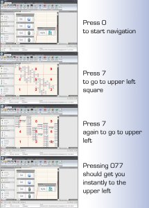
Now look at your keypad: pressing 0 activates navigation (because you need it often to type in numbers, we need a hotkey to initiate navigation on the numpad).
This gets you to an overview of the project.
Imagine the keypad being the map of your project, you now simply tab a number to get to the according section. Tab again and you zoom a level deeper.
So for the currently known zoom level you'd tap e.g. 077, or 056, if you like to stay one zoomlevel above, you use only 07 or 05. After a second the numpad switches back to normal mode (typing numbers).
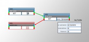
Also think about smaller icons in the template. You could reduce height and instead make the tooltip image bigger. Maybe use colorcoding, maybe give macros a good color, so you could easily spot them.
Anyway I thought about an easy navigation:
The template has some sort of internal bounding box (so the gui always knows, where the far most points are and creates an imaginarey box around the project).
Now look at your keypad: pressing 0 activates navigation (because you need it often to type in numbers, we need a hotkey to initiate navigation on the numpad).
This gets you to an overview of the project.
Imagine the keypad being the map of your project, you now simply tab a number to get to the according section. Tab again and you zoom a level deeper.
So for the currently known zoom level you'd tap e.g. 077, or 056, if you like to stay one zoomlevel above, you use only 07 or 05. After a second the numpad switches back to normal mode (typing numbers).
Also think about smaller icons in the template. You could reduce height and instead make the tooltip image bigger. Maybe use colorcoding, maybe give macros a good color, so you could easily spot them.
 ;-)")